
On the 14th of April, Anthropic's CPO Mike Krieger quietly resigned from Figma's board. Three days later, Anthropic launched Claude Design. Figma's stock dropped roughly seven percent the same day. We spent the following weeks putting Claude Design through a multi-view resource management dashboard to see whether it changes how we approach the prototyping phase. Here's what we found.
Key take-aways
- Claude Design keeps a design coherent across multiple screens. That's the part that actually matters, and it's where most other AI tools fall apart once you go past one view.
- The jump from design to a working prototype is quick. An internal system that would normally take weeks came together in a few days, and I could try out a lot of ideas cheaply along the way.
- The Claude Code handoff narrows the distance between design and development. A developer can pull out what they need in a format that already fits how they work with coding agents.
- It's earned a place in my toolbox without replacing anything in it. There's no pixel-level control here, it's all prompting, so it won't stand in for a real design tool. However, I haven't found anything else that gets you from a conversation to something you can actually click through this fast.
First week, first choice
The same week that Claude Design dropped, I was tasked with a resource management system (RMS) to prototype. I jumped at the opportunity. The "Figma killer" angle commonly pushed by other reviewers didn't resonate with me, but I had high hopes for how useful it was going to be for creating coherent prototypes. I've been burned by enough AI design tools that look great on one marketing page and fall apart the second you need multiple views sharing a color system, staying consistent across navigation, and actually feeling like one product.
The launch post mentioned two things none of the previous tools had: design system extraction from an existing codebase, and a direct bundle generation for Claude Code usage. That combination, if it actually worked, would land right in the middle of what we needed — operational software where a dashboard, an allocation grid, a capacity view, and a reporting screen all look and behave like they belong together.
Almost every Claude Design review I've seen since tested it on a marketing one-pager. I wanted to know if the designs would survive our scrutiny when tasked with working on screens for a comprehensive system.
What follows is the full story of that build, from the first prompt to the finished prototype. We haven't reached production yet, but we came out with something interactive and working — a base that the dev team could use to build the real thing on.
Prompt in, prototype out
Before diving in, a quick tour of what you’re actually looking at.
Claude Design is a two-panel interface — chat on the left, live canvas on the right. You describe what you want, and it generates an interactive prototype directly on the canvas. From there, you can refine through conversation, inline comments, direct edits on the canvas itself, Draw mode annotations, or custom sliders that Claude generates on the fly. A dark-mode toggle, a spacing knob, a corner-radius dial, whatever the project calls for.
Inputs are broad. A text prompt is the obvious starting point, but you can also upload documents, drop in images or wireframes, connect a GitHub repository, import a Figma file, or use the web capture tool to pull elements straight from a live site. Outputs are just as wide: interactive HTML, Canva export, an organization-scoped share URL, or — the one that really got my attention — a handoff bundle structured for Claude Code to pick up and build from.
Claude chat can already generate interactive artifacts, and it can carry context between turns. What Claude Design adds is a visual canvas where you see multiple screens side by side, a design system that exists as a structured, extractable object, and a downloadable bundle that packages style primitives, component specs, and layout hierarchy into something Claude Code can actually build from. Chat gives you one artifact at a time and hopes you keep the thread going. Claude Design gives you a workspace.
The product runs on Claude Opus 4.8 by default, while you can also switch to other available models if you prefer. It is included with Pro, Max, Team, and Enterprise subscriptions for Claude.
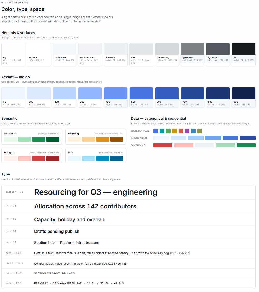
Design system from a paragraph
I ran this experiment on a Claude Max subscription at $100/month, back when Claude Design had its own separate usage pool. Even on that tighter preview allowance, the whole multi-view build stayed well under the ceiling. Anthropic has since merged Claude Design into the same pool as Claude.ai and Claude Code, and that actually gives design work more room: the shared pool is much bigger than the old dedicated bucket, so unless you're already maxing out chat and Code, you can push it harder now. For a single screen or a lightweight mobile app, a Pro plan probably gets you there. If this becomes a daily driver for high-volume prototyping, the higher tier still earns its keep.
If your company already has a brand book, a design system, or even just a live product with established styling, you can feed that straight in — Claude Design will extract style definitions, typography, and component patterns from it and use those as the foundation for everything it generates. I went the other way: rather than pointing it at an existing site or codebase, I asked it to generate a design system from scratch.
My prompt described the application domain — dense data grids with pinned columns and per-cell visualizations, time-based views at daily, weekly, and monthly zoom levels, charts coexisting with tables on the same screen — and set the visual tone explicitly: restrained, trustworthy, dense-but-calm. Basically, I asked for an interactive palette of the system in action.
After I sent the prompt, Claude Design came back with a few clarifying questions about how the design system should be shaped — mostly probing my personal preferences. Each question had a few predefined answers you could click, an option to type something else, or a “you decide” button for people who trust the model to make the right recommendation.
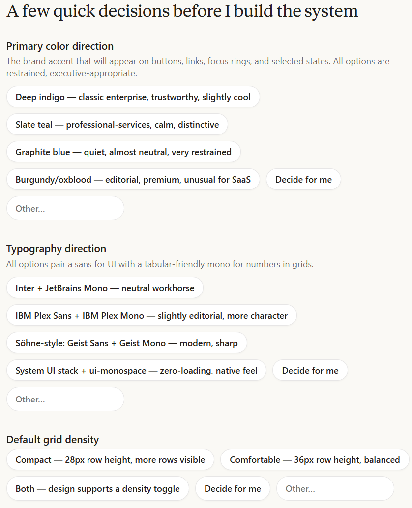
What came back was surprisingly coherent. Claude Design produced a complete palette, a type scale, spacing and depth primitives, and a component gallery covering buttons, chips, table rows, modals, and empty states — all internally consistent and clearly shaped by the tonal direction in the prompt.
Teaching Claude Design what the product should look like is half the setup. Teaching it what a system is supposed to do is the other half — and that second step is where the realism of the output lives or dies.
The organization-wide default
The recommended way to begin with Claude Design is to set up an organization-wide design system first — extracted design specs, component vocabulary, and voice that every new prototype inherits by default. For consultancies and product teams running multiple internal tools, this becomes a piece of organizational infrastructure: defined once, inherited automatically, overridable per brief when a particular product needs its own look.
For this experiment I deliberately ignored that advice and generated a fresh system from scratch, partly to test how Claude Design handles the cold-start case and partly to keep the run self-contained.
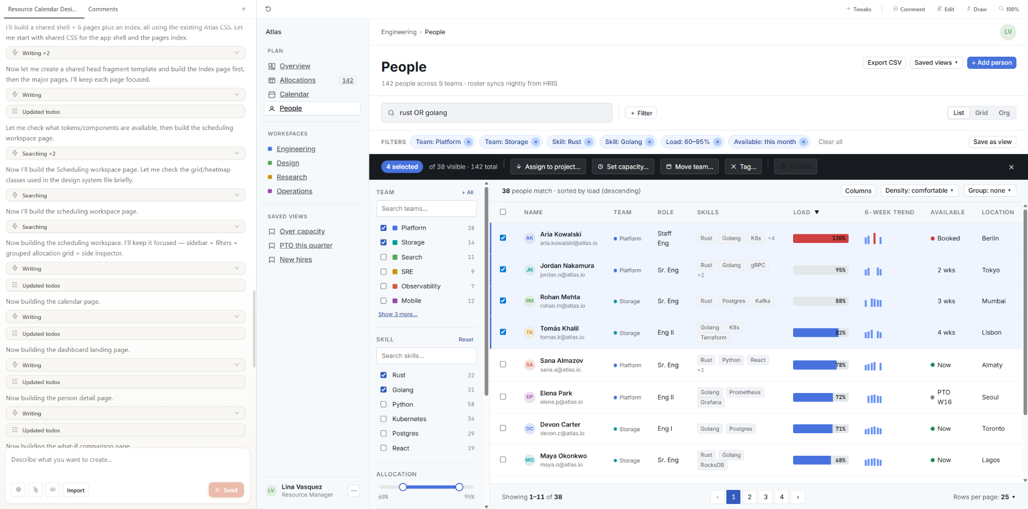
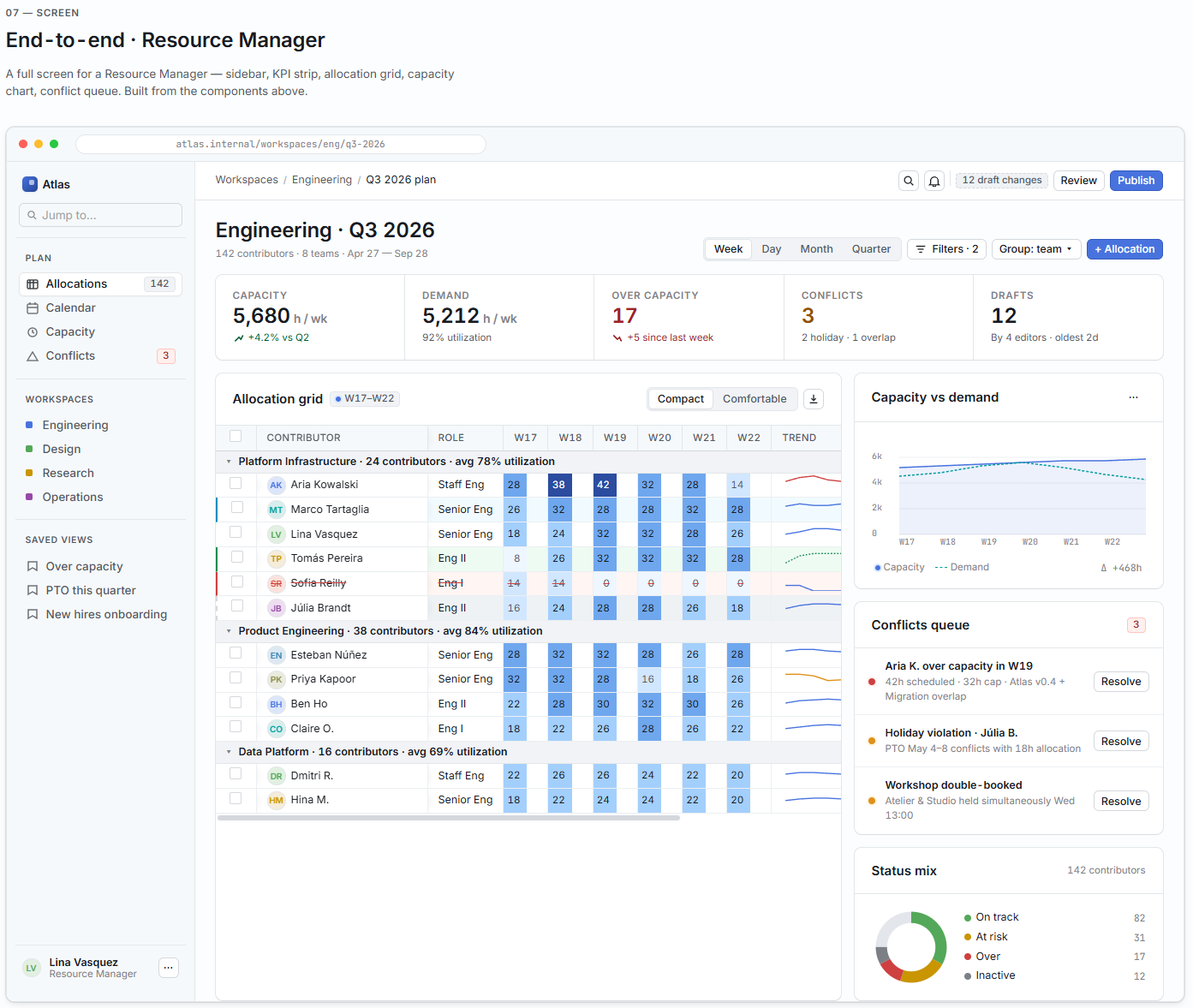
From prompt to allocation grid
The next prompt described the full system in one go: a dashboard with utilization metrics and headcount summaries; an allocation grid with per-person rows and per-week columns; and a per-project capacity view showing assigned staff against available hours. I named the visualization types — sparklines, heatmap cells, stacked bars — specified that the audience was internal project managers who already know the domain, and hit send.
Claude Design generated all the views in a single turn, and cross-view cohesion came built in — shared sidebar, consistent type scale, same color definitions from the design system. No re-pasting between generations.
There’s a subtler win here too. Most AI design tools betray themselves on sight — you open the output and immediately spot the telltale signs: gratuitous emoji scattered across dashboards, candy-colored gradients that no designer would choose for an enterprise app, perfectly symmetrical layouts that feel eerily uniform, and stock-illustration aesthetics that scream “generated.” Claude Design largely sidesteps that — the output is tunable and the decisions on copy, layout, and features actually make sense.
Most AI-generated design work falls apart under scrutiny because those decisions don't hold up. The microcopy reads like filler, feature groupings feel arbitrary, and layouts that look plausible at a glance collapse the moment someone tries to walk through a real workflow. Here, the content and feature choices come out thoughtful and coherent.
A code-first prototype, side by side
The resource management system tested visual coherence — whether multiple views could share a design system without drifting. It didn't test interactivity. So I ran a completely separate project through Claude Design: an agents observability dashboard with fleet status, per-agent runs, incident triage, and cost views. Where the RMS was heavy on layout and information density, this one was heavy on state — hover tooltips, selection-driven evidence trails, forecast overlays. Different project, different question: whether a single prompt could produce a prototype that actually behaved.
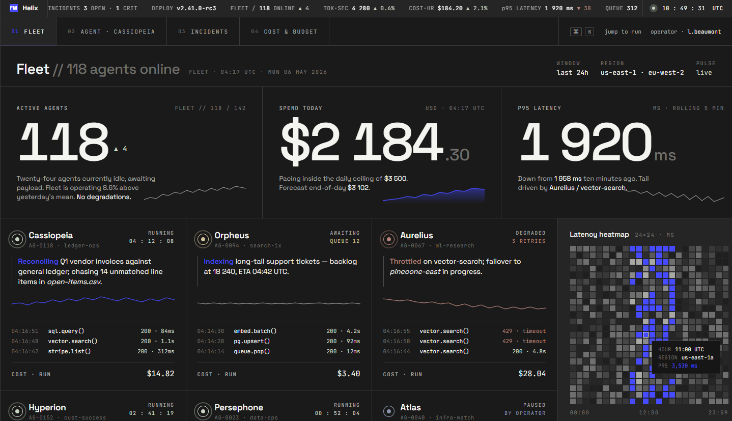
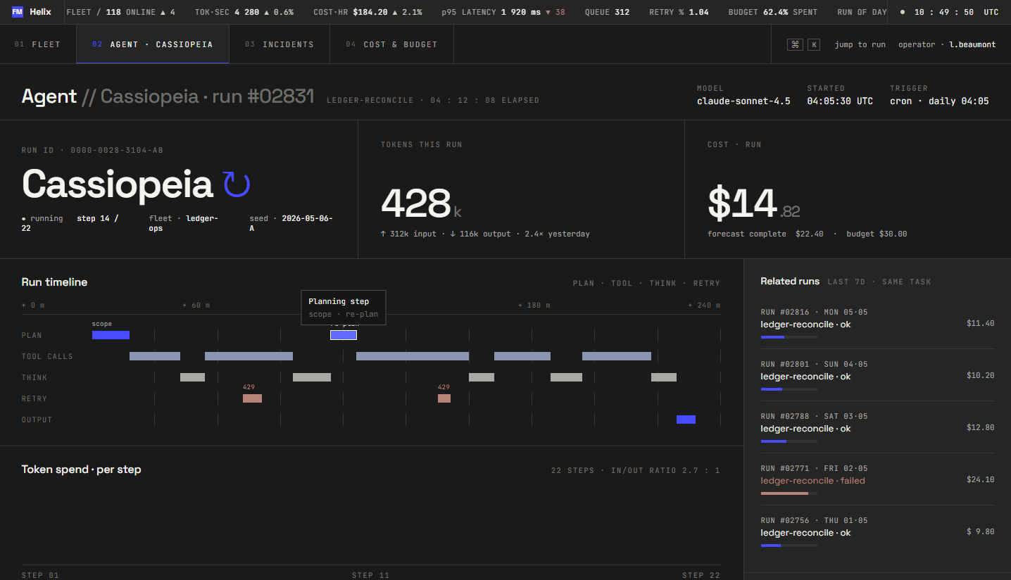
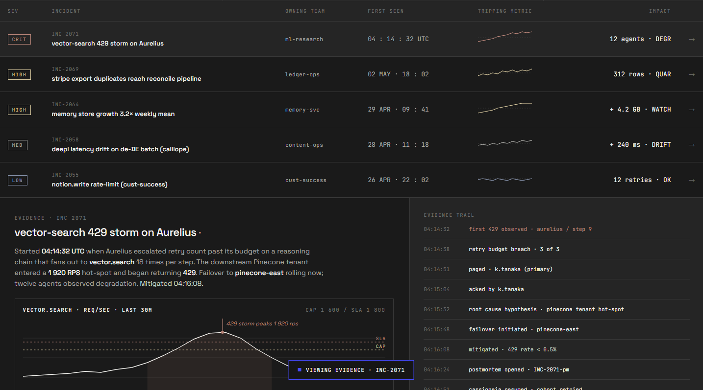
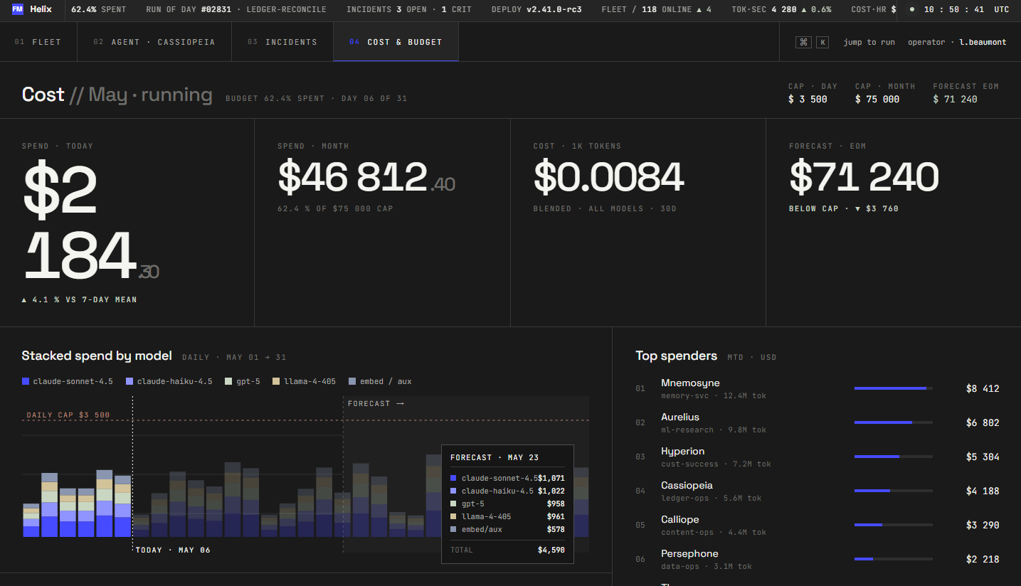
From a single prompt, Claude Design was able to produce four navigable views that were closely tied together and fully interactive. All of the example data was filled end-to-end, followed by the interactive charts that accurately displayed relevant metrics on hover. The tool paid very high attention to details while staying fully consistent with the earlier defined design system.
Handoff to Claude Code
Hit “Share,” pick “Handoff to Claude Code,” and Claude Design packages your work into a downloadable bundle. Inside you get a machine-readable component spec, the design tokens used on the canvas, a layout hierarchy, referenced assets, and a README that tells Claude Code how to interpret the files and match the visual output in whatever stack fits your existing codebase. There’s also a generated prompt you can paste straight into a local Claude Code session.
I passed the bundle, and the result was compiled and rendered. The views loaded, the navigation held, and the design tokens mapped to actual CSS variables rather than hardcoded hex values. What I got back was a single scaffold with shared routing and a component library that referenced the system Claude Design had extracted earlier.
That said, “compiles and renders” is not “production-ready.” This workflow can easily introduce technical debt if Claude Code users aren't vigilant. The same review cycle you’d apply to any AI-generated code applies here: an accessibility pass, a performance review, and a security check before anything goes near a real environment. Claude Code handled the structural translation well, though the judgment calls about how the rest of the system fits behind it remain engineering decisions.
What matters most to us is the integrated workflow: you get an interactive skeleton faster than any prior tool combination could deliver. Turning it into a shipped product is still engineering work.
The comparison matrix
No tool review is complete without the “but what about…” section — so here’s the comparison I would have wanted to read before starting, scored specifically against the multi-view resource management system rather than a hypothetical best-case demo.
For a single-page marketing site, most of these tools get you there. The ranking shifts once the scope becomes a multi-view internal tool that needs to respect an existing brand. At the prototyping stage, the deliverable is the frontend. Nobody sitting across the table cares what's behind the mockup — they care whether the allocation grid makes sense and whether the dashboard looks like their product.
That's the problem Claude Design is built for. It extracts your style definitions, applies them across every view, and packages the result so Claude Code can build from it inside the stack the client is already using. You get a prototype that looks just right.
The expensive seam
The gap between design and development has been the costliest part of software consulting for twenty years. A designer produces mockups, a developer reinterprets them, both sides iterate on the difference, and two weeks later the client finally has a prototype to react to. Tools like Claude Design close that gap to a couple of days. The exploratory stretch at the front of a project, the part that used to burn weeks before anyone had something concrete in front of them, now moves in days.
Faster doesn't mean right, though. A prototype that lands in two days can still be the wrong one, and working out whether it's what you actually want is its own job. What Claude Design changes is how quickly you get to something real enough to argue about.
For a consultancy that bills design and development as separate line items, this isn't theoretical. Clients are already showing up with prototypes in hand. After this experiment, I'll keep the conclusion narrow: the design-to-prototype phase of an internal-tool engagement got much faster for us.
Three limits worth flagging
Three practical limits showed up during the experiment, and they are worth knowing about before you make this a daily habit.
The first is usage, and it's eased since we ran this. As noted earlier, Claude Design had its own allowance during the experiment and has since moved onto the shared Claude.ai and Claude Code pool, which gives design work more headroom. The caveat that remains is that heavy prototyping competes with your chats and coding sessions for the same budget.
The second is the export flow. Since every export runs through the model as a prompt rather than a precomputed download, each attempt burns a lot of tokens. There’s currently no one-click option that bypasses the conversation loop, which would be a welcome addition for routine sharing or quick downloads where you don’t need customization.
The third will matter most to the traditional designers: there are no direct-manipulation tools. You can't grab a margin and drag it, nudge a text box twelve pixels left, or eyedropper a color from one element onto another. Every adjustment, no matter how small, is a prompt. That's fine when the change is conceptual — "make the header bolder and shift the palette cooler" — because describing intent is what the conversational model is good at. It's less fine when you know exactly what you want and could express it in two seconds with a slider but instead have to type an entire instruction like "reduce the padding between the icon and the label to 8px," wait for a regeneration, and check whether the model touched anything else in the process.
For designers accustomed to Figma, where spatial tweaks are instantaneous and non-destructive, this friction is real. It doesn't invalidate the workflow, but it does reshape where Claude Design fits: stronger for exploring directions and generating first drafts than for pixel-level polish. On the other hand, that level of perfection takes a lot of additional effort, while not being as impactful when it comes to the real implementation.
When to reach for it, when not to
The fairest way to frame this is as a set of scenarios rather than a single verdict, because the real answer depends on what you’re building and what you already have in place.
If you’re starting a greenfield project and need a clickable prototype in a hurry, just grab it. It handles the jump from a rough idea to something stakeholders can actually play with, and the built-in design system means you won't have to explain away a messy wireframe. It works just as well for brand decks with a very short deadline. The template-to-conversation workflow handles this better than staring at a blank slide while your coffee gets cold.
However, it isn’t a drop-in Figma replacement. You’ll still want Figma for the heavy lifting—deep component libraries, pixel-level precision, and the plugin ecosystem. While Claude Design is a serious challenger to prompt-to-prototype tools like Figma Make, it's more about "skipping the design tool" for fast, functional output rather than managing a long-term production canvas.
Claude Design takes over the prompt-to-prototype slot (Figma Make, Google Stitch, and the like), and it's the one I'd reach for. What it doesn't replace is a full design platform: the deep component libraries, multi-designer collaboration, and pixel-level control Figma gives you. It gets you a prototype and a head start on the code, the result isn’t production-ready.
Where Claude Design lands
Claude Design is the best prototyping tool I’ve used for this kind of work — multi-view internal tools where brand coherence and information density both matter. It has clear limits: Figma still owns the pixel-level polish, the component libraries, and the multi-designer collaboration. It also stops at the prototype, so turning that into a production system is still your job. But nothing else I've used turns a conversation into a working prototype a developer can build on this fast.