.webp)


Designing a native app or a simple website can be a process that is dragged out by a (rather) inexperienced designer or can be simplified by proper preparation.
We would like to shine some light on how we prepare our design environments and set up the foundations that allow us to work on designs in an efficient manner. So when the client needs to make one change that influences 50% of the website We don’t have to manually change 50% of it, but a few clicks here and there will suffice.In this article, We would take a closer look at what UX designers can do to prepare a solid foundation to build consistent mockups, and easily update both desktop and mobile projects later on.
The focus will be on Figma but most of the programs have similar features. Let’s start by searching for elements that can be used as a foundation to build beautiful, organized, and consistent designs for websites, apps, or other digital products, saving your product’s budget for more valuable features or analysis.
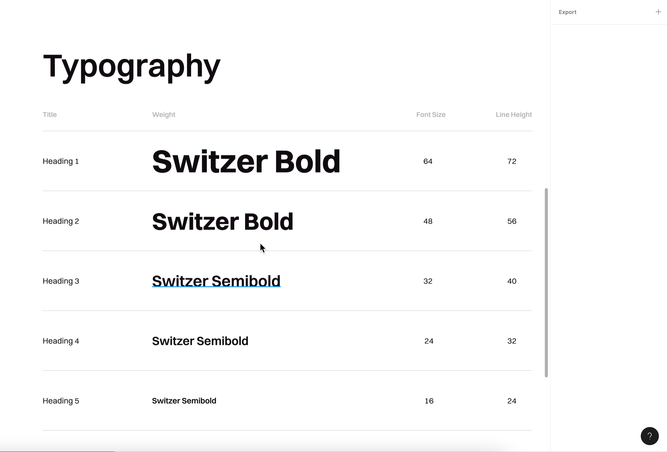
Defining your project text styles upfront will save you time during later phases
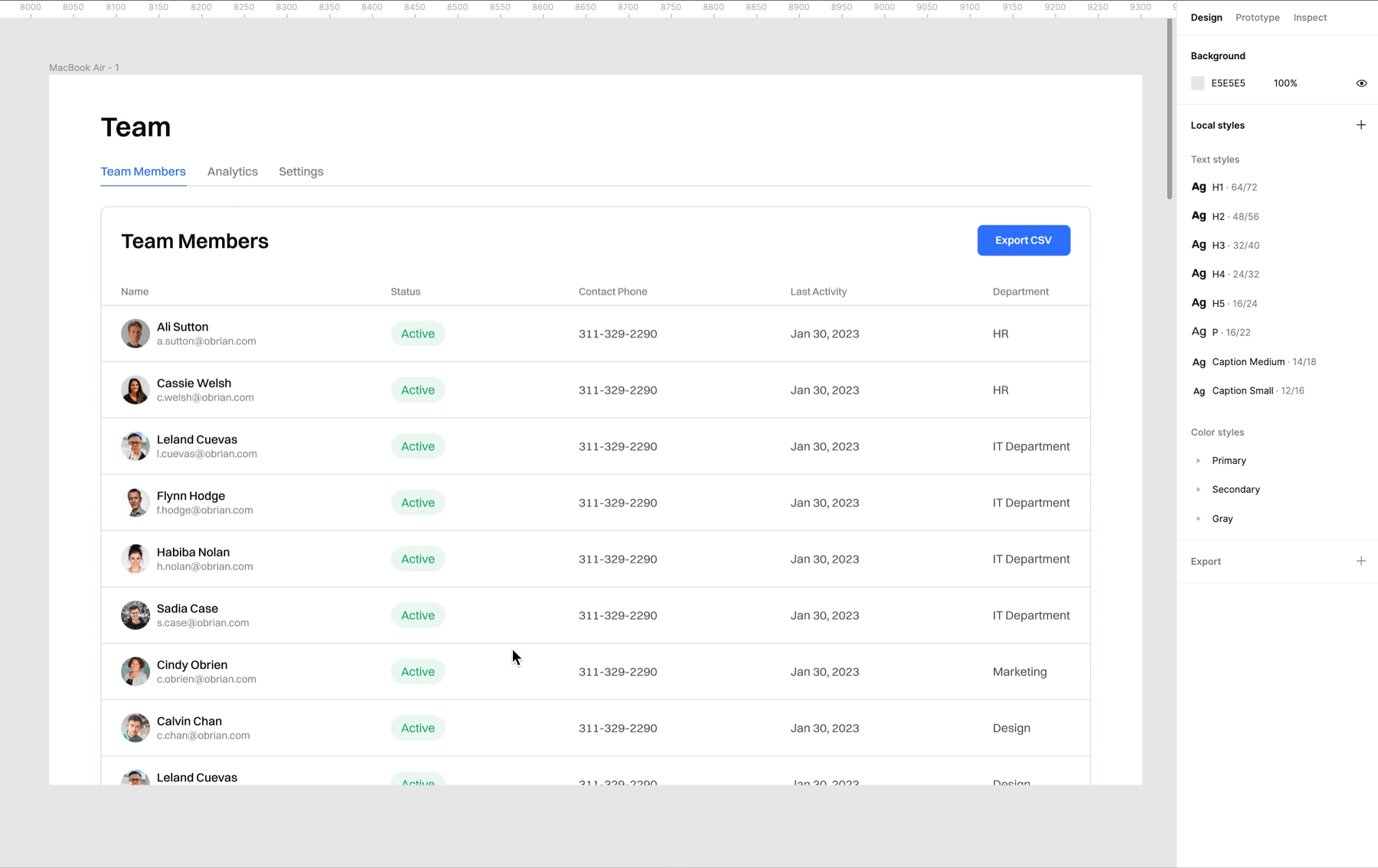
The first step in preparing your workspace should be to define your text styles. If you define text styles before starting to draw mockups, you’ll only need one click to update them in your designs. In the beginning, it should be enough to create a few basic styles for elements like headers, subtitles, and the body.
Later you can enhance your text styles library. Remember to properly define line-height in the text function and alignment. It’s very important to set text contrast, but don’t limit yourself to black only. All these features can be found in the text menu. Play with them to find the best choice for your design.
Defining your text styles from the getgo is a great time-saver because if you want to change a typeface or text height in your designed mockups, there will be no need to click on every line and change it manually.
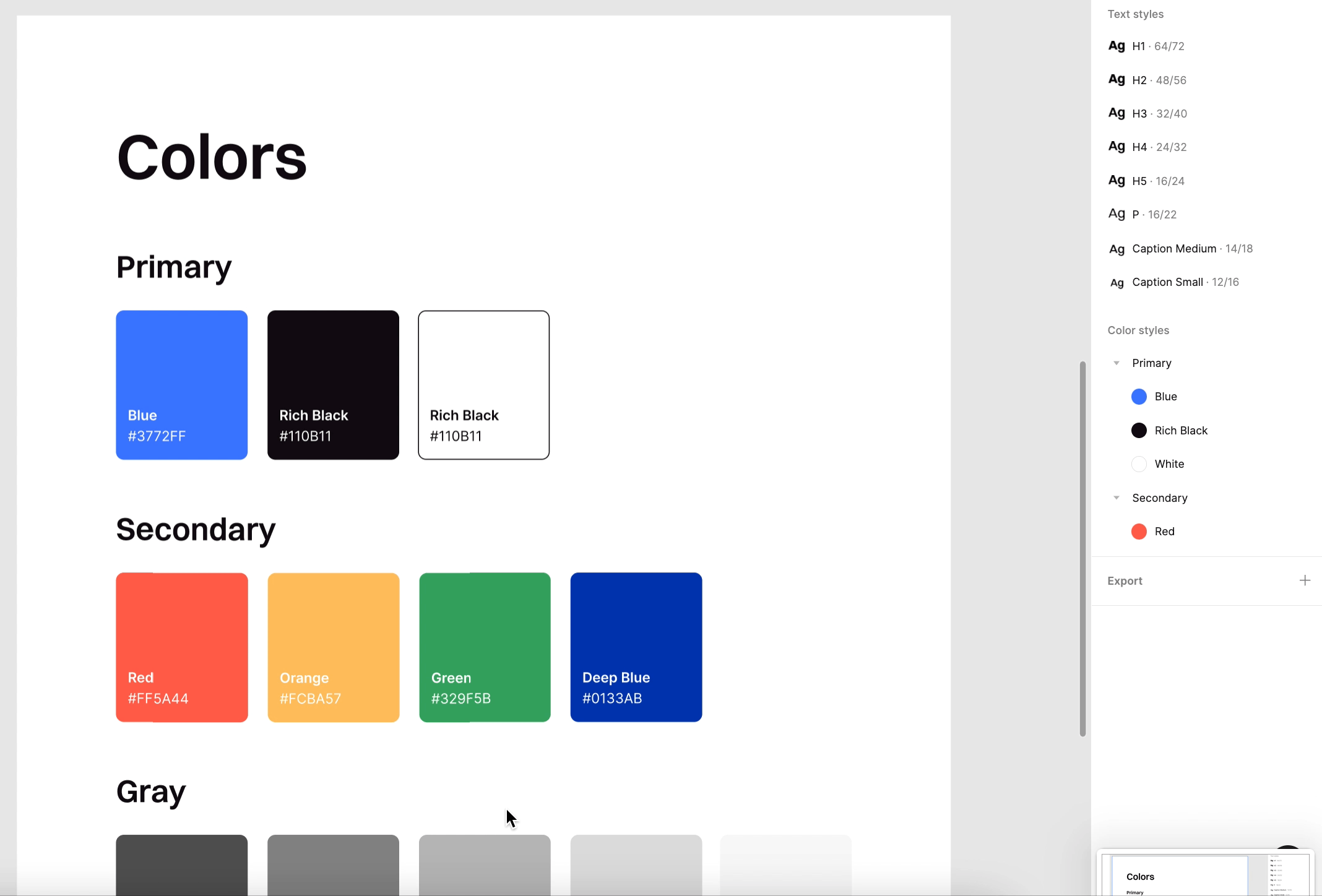
Defining color styles helps you make quick changes and updates to your designs
Color styles work just the same as text styles. You can edit them by updating the current style or creating a new one. Just like your text styles, it’s also very important to define your color styles from the very beginning. These two elements are the basic building blocks for the other components in your design.
To start, build a primary palette with frequently used colors. Then create a secondary palette for less-used and accent colors, which should have less than 10-15% visibility in your designs.
Your color styles aren’t only the plain colors you’ll need for your design. Don’t forget to also define the colors for icons, buttons, background, highlights, cards, and more. Remember to set borders, shadows, and gradients as well. You need to define all of these from the start to facilitate further phases, using different variations of components in your project. Setting this beforehand saves lots of time when working on the design in later phases - you don’t pause on each element wondering which gradient, hue, color, or font to use.
The clear structure of the design components
Best practices tell us to group our text styles, color styles, and symbols by category for better management. It saves us time when looking for specific elements for our designs. People’s brains are programmed for organized structures. In Figma, this is really easy.
When naming a new element, think about the categories from their main, general category to their more detailed group. Use a “/” to separate parts of the name, for example, “Checkbox/Unselected.” After we create a component from each of them and combine them as variants, Figma will automatically segregate elements into groups by those properties.
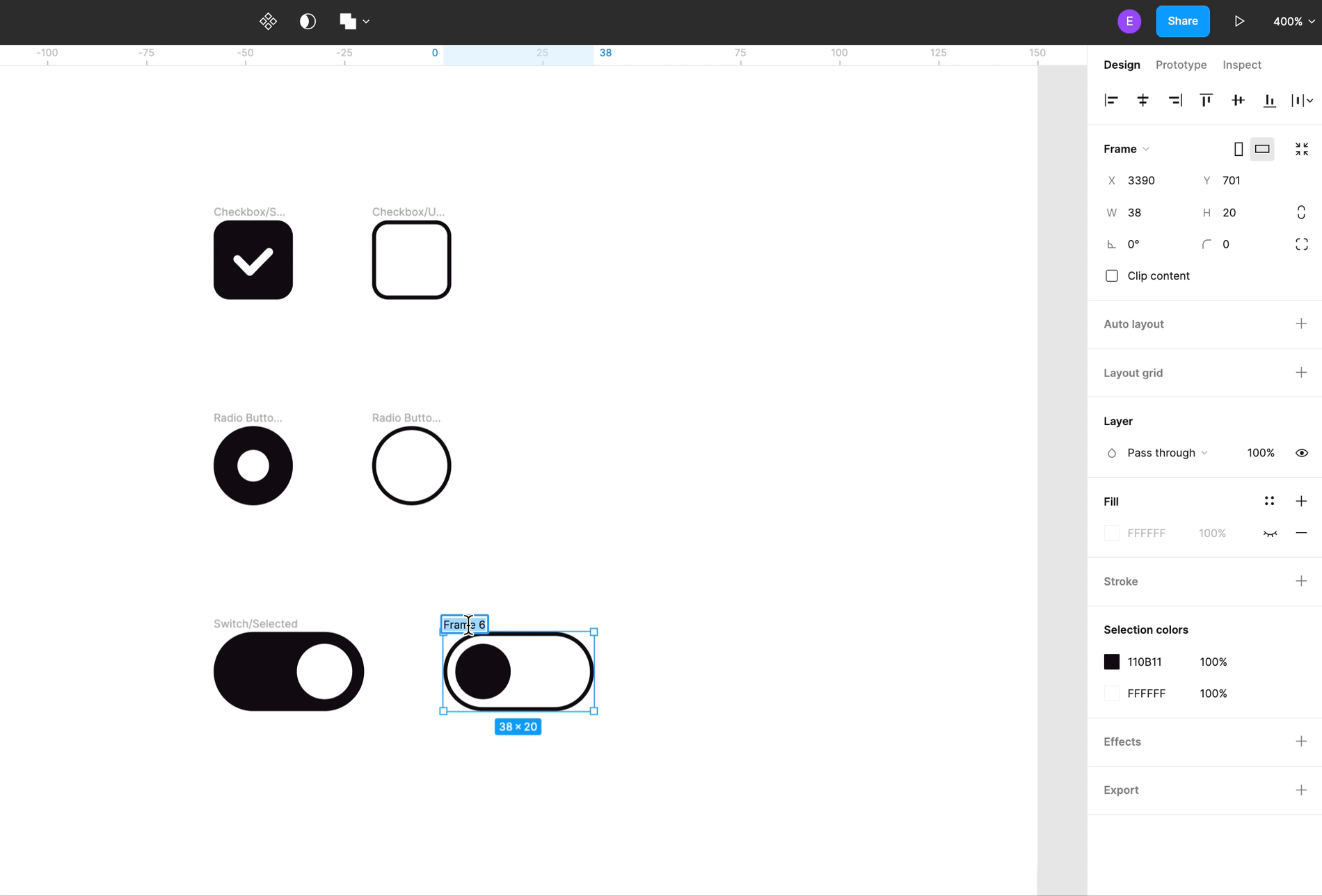
Variants allow us to organize similar components in one set and make it easier for everyone on the team to find and reuse them.
Save time by creating components with overrides during the design process
A quick explanation for those who don’t know what a component is in Figma. Components are elements that you can reuse across your designs to make them consistent. You define the properties of the main component and then reuse instances of this component. If you make changes in the main component, all instances also change. You can create components in a single file or publish it to the team library and use it on multiple files.
Before you start creating components and more complex structures make sure you determine text and color styles first. It makes a big difference when you want to use icons in different colors or change a button’s state, for example. This is because when creating a simple component, like an icon, you also have to define its color. But in the project, you’ll need more colors than the default ones you’ve set, for example, choosing gray for the inactive state or blue for clicked or hover state. When you don’t define color styles at all, you need to create 3 separate icons as components.
But if you’ll set a previously defined color style to the icon, during the component creation process, there’s no need to prepare different color variations for this icon as a component.
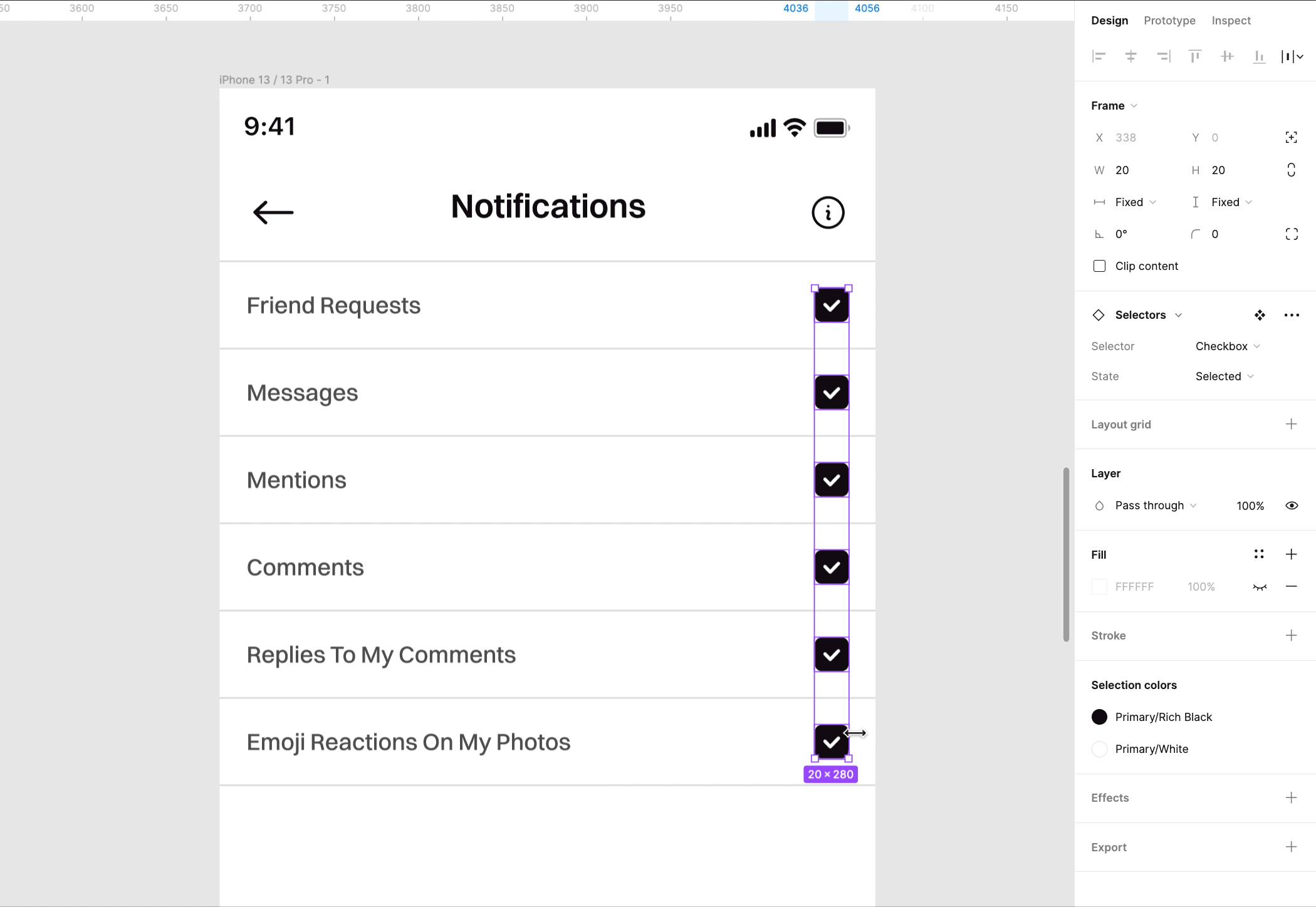
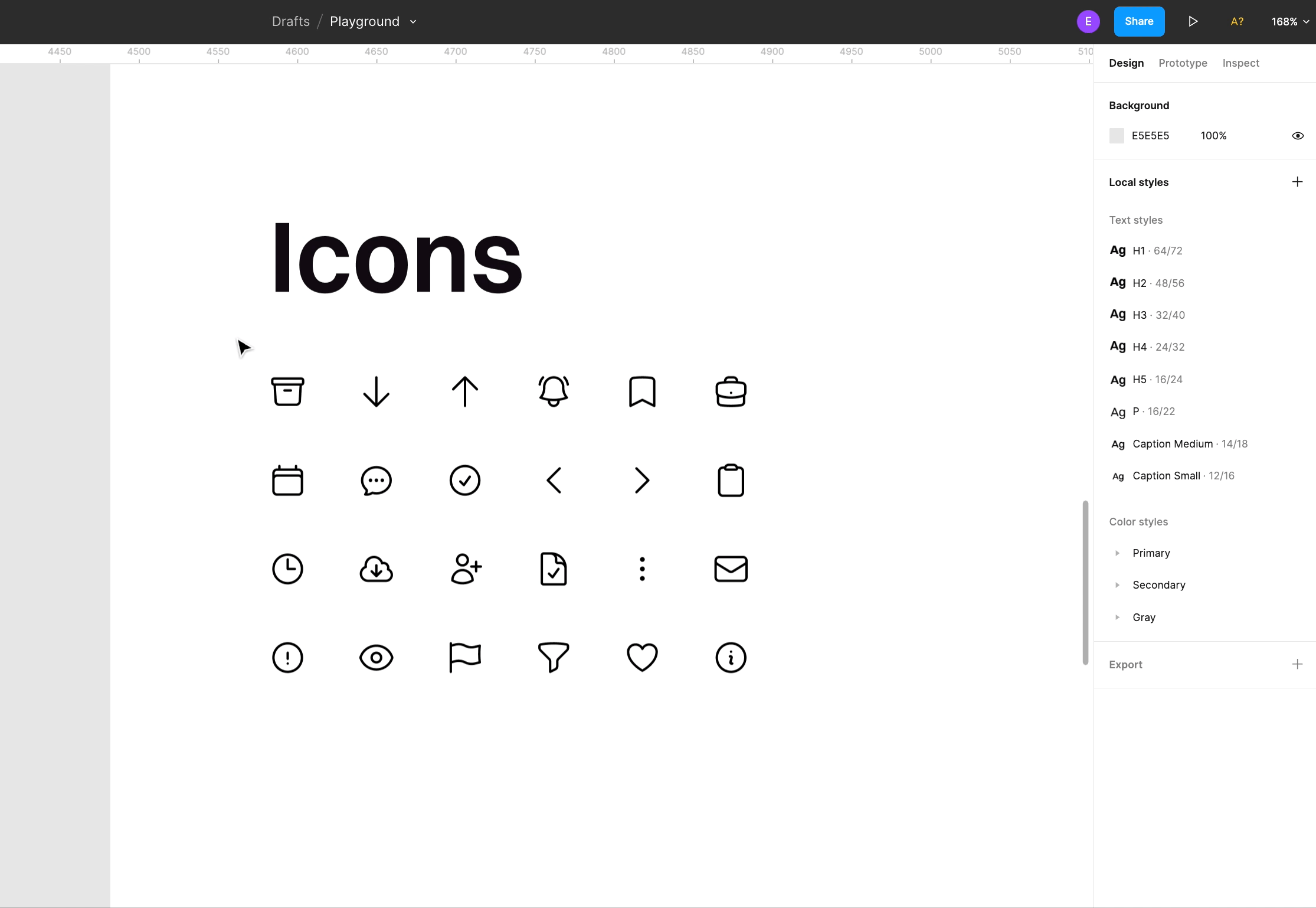
Overrides are really important for helping designers adjust variables of components to fit the project needs. You can start from basic elements, like an icon, to a more complex and advanced structure like bars, lists, and whole pages. There are also a few amenities that help to build more advanced components with text and transform them the way you want.
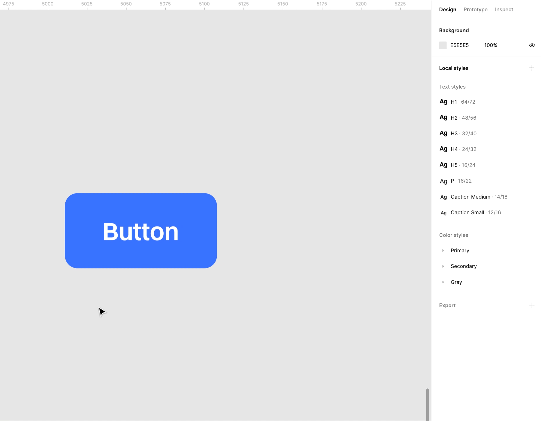
Let’s take a look at the button - a very popular element in the digital design
A button can consist of a few elements which can be our variables - color style, text style, and icon. The goal is to create one button as a component and use overrides (variables) on the project page to have multiple options for the look of this button. I usually use the auto-layout option to make buttons dynamic, which resize themselves based on their content. When it comes to color, that part is easy and we went through it previously - the key is to determine a color style so you can simply change the color of the button.
After this, comes the button copy
We apply a text style and define its alignment and position in relation to the button’s border, followed by adding an icon. If you want to change the icon there is one rule: They must all be the same size. Remember to group content together (text and icon).
Now, we’ve created a component
Our next step is to apply the auto-layout feature to the component so that we can determine the flexibility of this element. In our example, we can change the text length and the button adapts, preserving paddings. It works really well on various types of elements.
Below is an example of how we can use our component using these overrides.
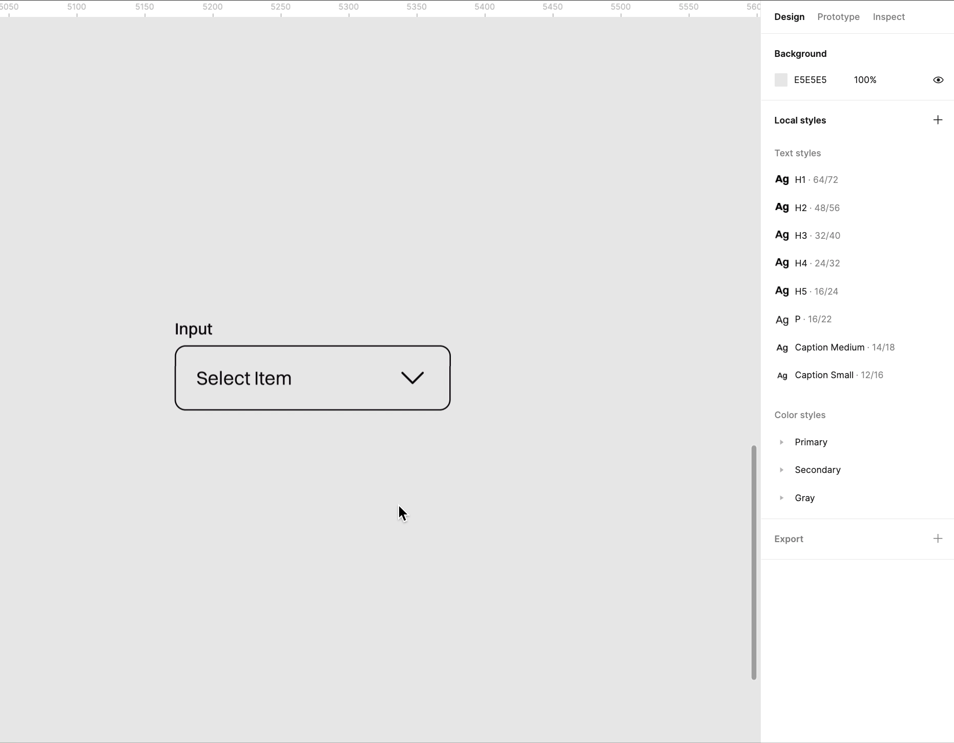
Another very useful element in digital design is input. You should now be able to see how to create one input as a component and use it in different variations in your project depending on your need.
There is one important difference between buttons and inputs - there is a need to increase border length, not text length. How? Use Space Between spacing mode in auto-layout. On your project page it should work like this:
Understanding how you can set a component’s features, and early on in your designing, allows you to design more complex elements while saving time and making it easier to make changes in future phases of the UX design process.
Set a hierarchy in your project to keep it organized and structured
I like to keep all my work in order and in groups. It also makes it easier for other designers to figure out and track down elements of your project when everything has a clear visual hierarchy. Let’s take a glimpse into the auto-layout feature of Figma.
Auto-layout allows you to set a clear structure of your elements, keeping proper spaces between them and stacking them in the same places. When you prepare it right, you have a far easier way to change the order, replace elements, and change spaces between them.
Let me show you how it works:
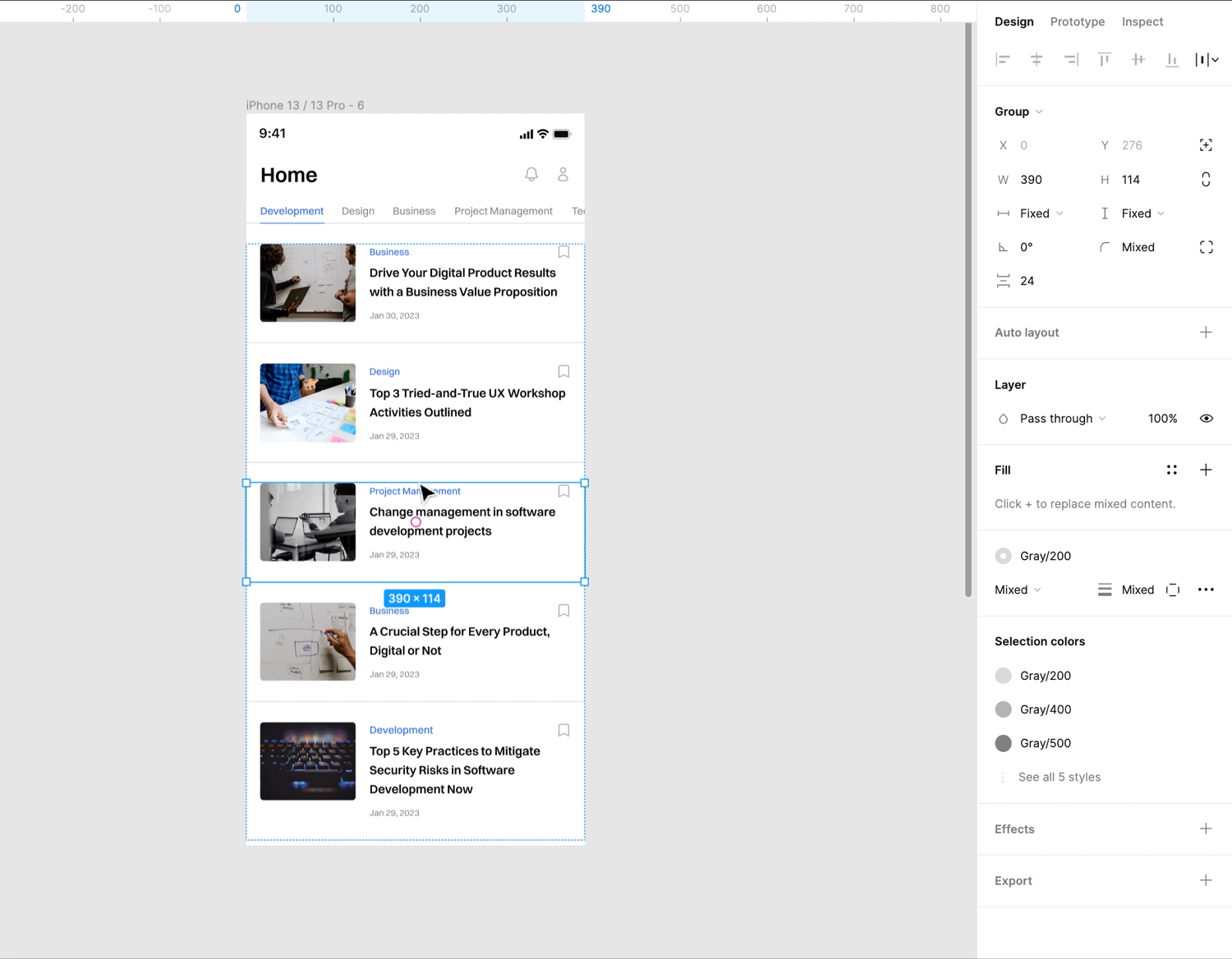
Auto-layout is especially beneficial for tables and forms when we have multiple elements that go under each, vertically or horizontally, like forms or tables. First, we should have determinate elements that our structure will consist of. In forms, these are inputs and selectors. When it comes to preparing tables I always start by designing a single row and their possible states and appearance as a component. This kind of preparation was mentioned in the previous section.
Saving time with design best practices
The UX design process is an integral part of the Digital Product Journey. Helping clients to understand how their digital product will provide value and be a delight for the end-users is why UX is so important. Saving your client’s time and money makes you a more valuable UX designer, so speeding up your workflow, without sacrificing quality, makes a lot of sense.
To accelerate your workflow, it only takes a few steps to prepare your work environment before you start drawing designs. The foundation you build from the start will make it easier to implement changes in the later stages of your UX design process. It also speeds up the pace of making these changes, saving yourself and your client valuable time.
Takeaways
- Define your text and color styles at the beginning. It will prevent time loss in the future
- Have naming conventions. Organize your components for better management
- Create components, using variants and auto-layout settings.
- The hierarchy of elements allows you to keep everything organized. You can use auto-layout to facilitate implementing changes
Our experienced team of designers has helped many clients improve their product UI/UX. If you’d like more details on digital product design, reach out to us. We’d be glad to share our experience.


